My Guest Bedroom Reveal with Gabby
Take a Tour of My Guest Bedroom
Please note that this post is in partnership with Gabby and
includes some affiliate links, which give me an opportunity to earn a commission from sales at no cost to you.
Today I’m giving you a tour of my guest bedroom! It was such a pleasure to work with Gabby on the space. They have been a favorite furniture source of mine for years and I’ve featured their beautiful transitional pieces on my blog in the past, including my recent feature in Cottage Home magazine! If you’re already familiar with Gabby, then you know that their designs are filled with special details, quality materials and clean, transitional styles.
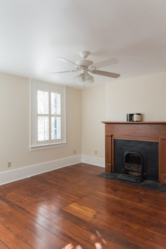
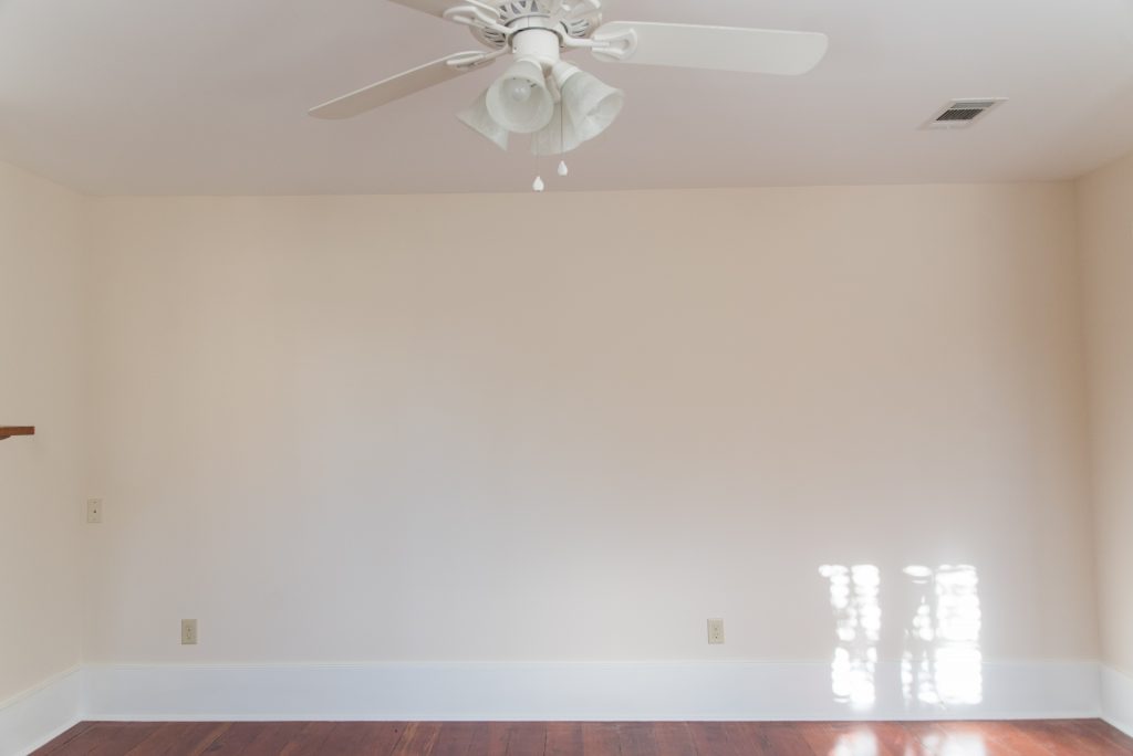
The ‘Before’.
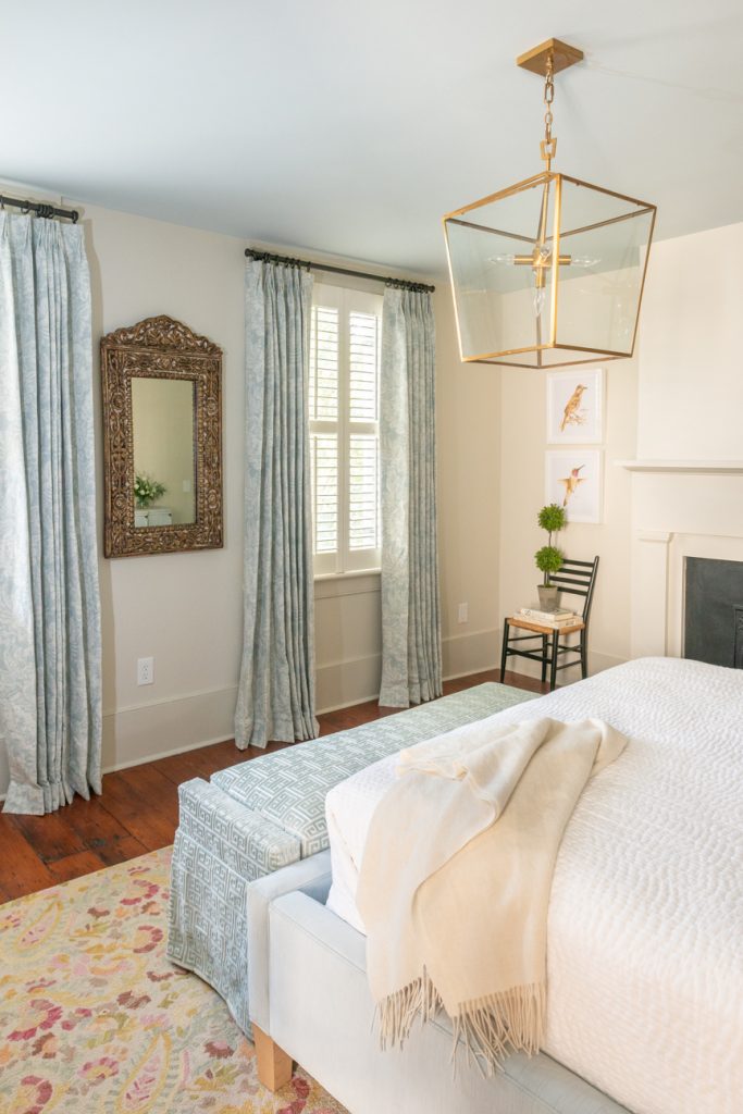
First, let’s start with the before pictures. I really love the abundance of natural light from the two windows that overlook the courtyard. Before we purchased the home, I fell in love with the fireplace, high ceilings and original hardwood wide plank floors.
The Refresh Plan.
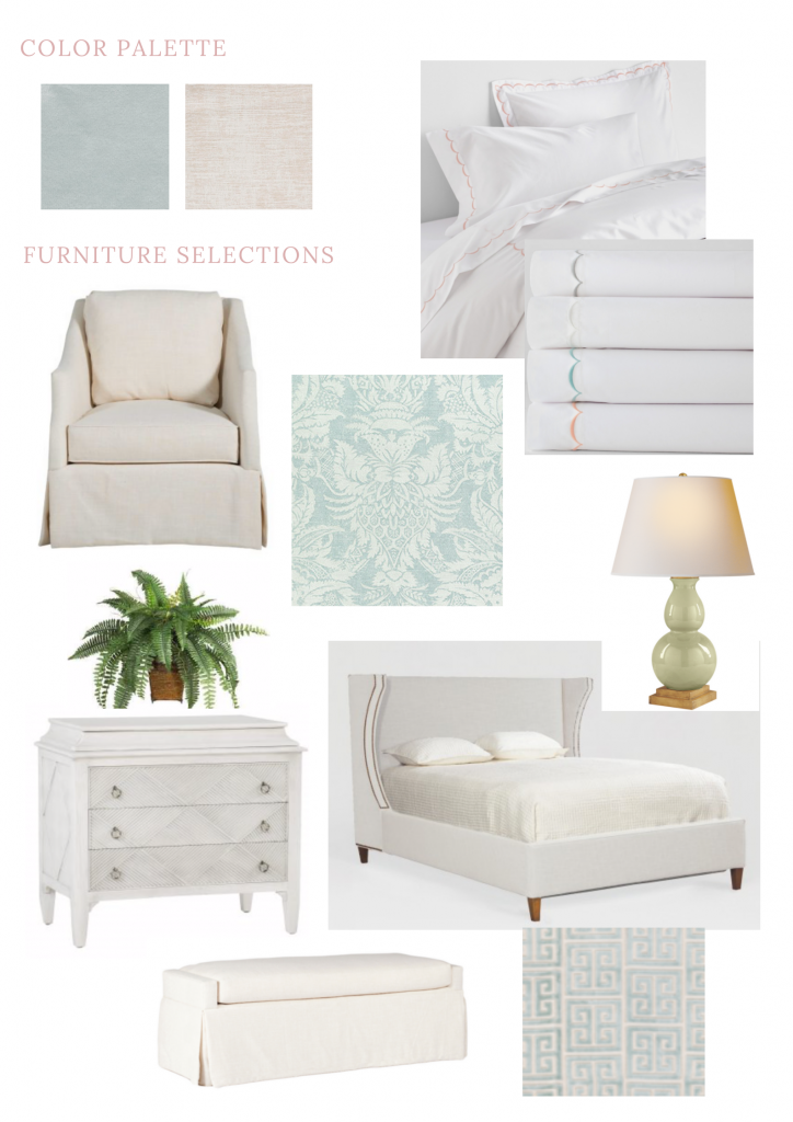
I was lucky to start with a blank slate! I always create an inspiration board for every space that I’m decorating because it helps me see how everything will look together in the room.
The only major change from the inspiration board is that I removed the chair, for good reason. I loved the swivel chair so much that I placed it in my double parlor. It was too good not to use everyday! I also added a bit more color through pillows, artwork and a rug. However I pretty much stuck to my original inspiration board in the end.
Lighting.
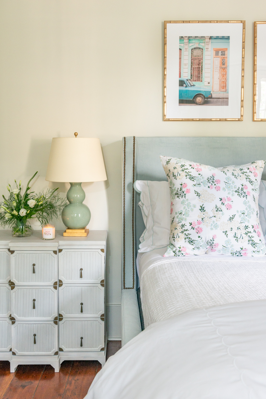
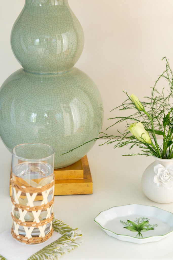
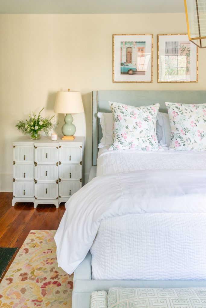
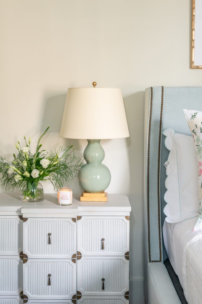
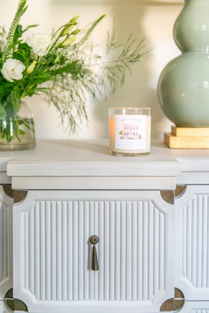
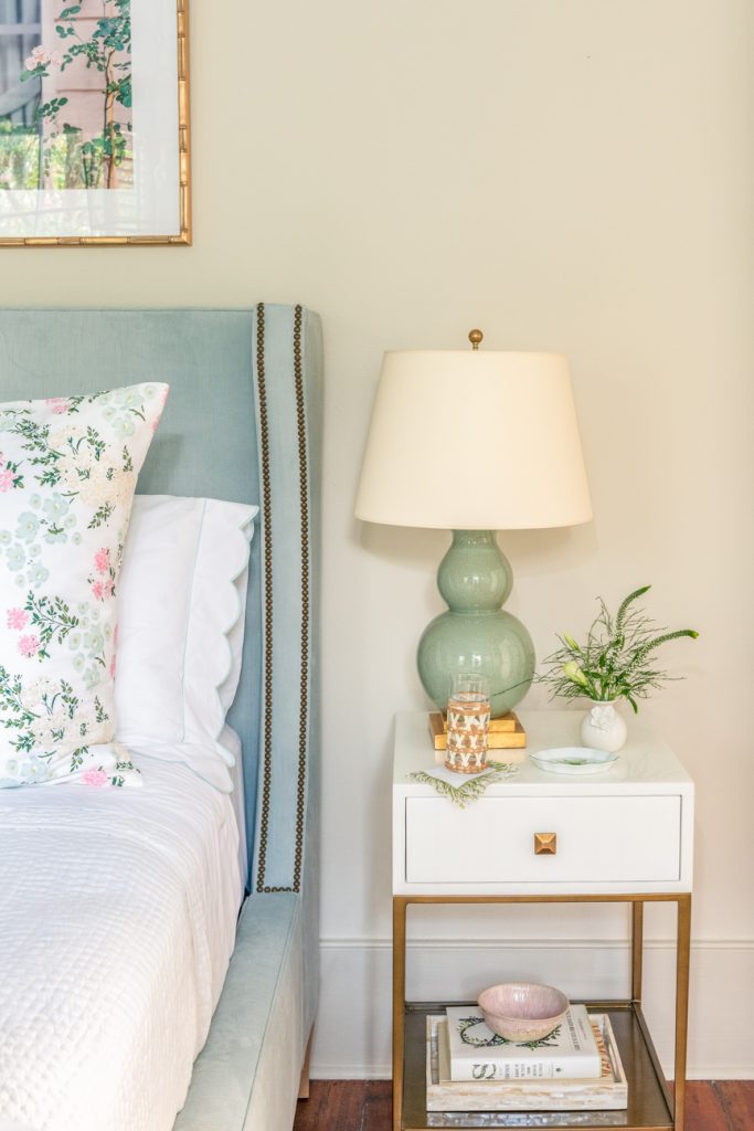
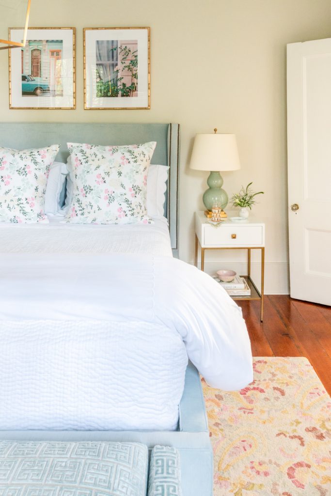
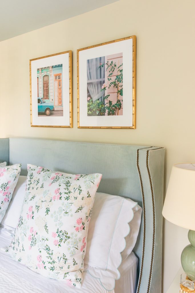
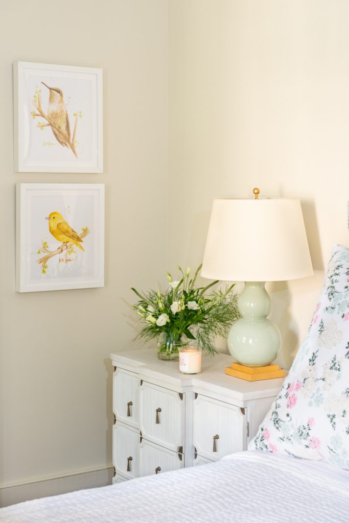
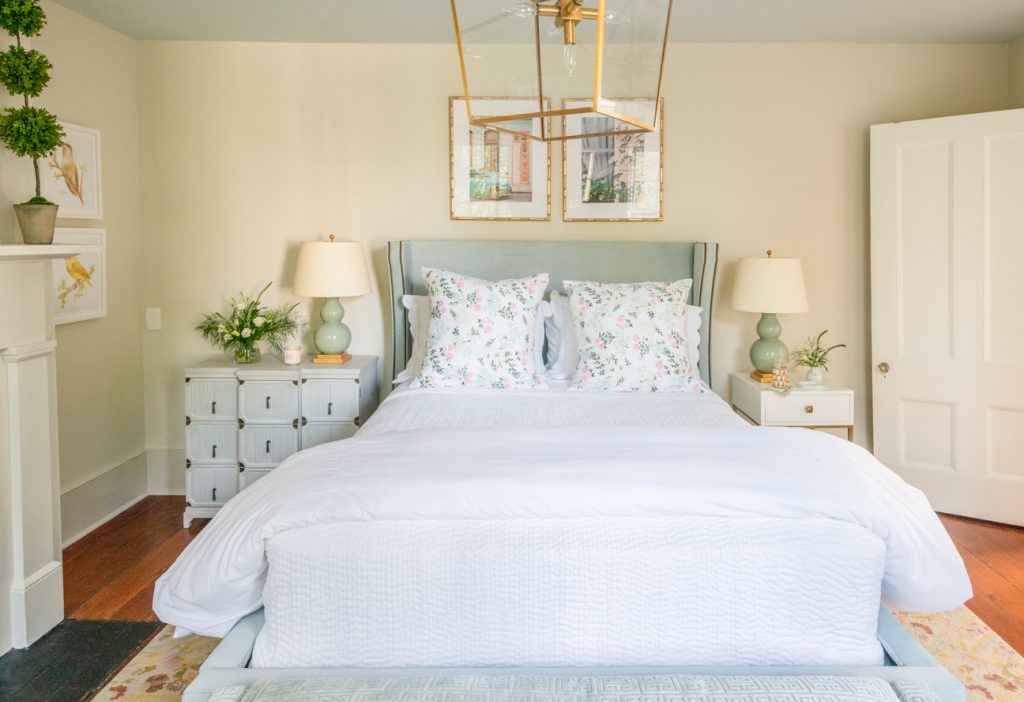
I styled each night stand with Circa Lighting’s Gourd Table Lamps (c/o) in celadon. The brass base brings out the pendant light in the ceiling and the artwork above the bed. The color of the lamps is a pale green and looks great next to the soft blue upholstered headboard. It’s a very soothing color palette.
The glass lantern above the bed is similar to the Darlana Lantern which is nice because it doesn’t have any glass to maintain. The exact fixture, the Camden 5-Light lantern, is a bit more transitional which works well with the overall style of the room. Both are great options!
Furniture.
The showstopper in the space, I think, is the gorgeous upholstered bed with brass nail heads. This specific piece is called the Aria Bed (c/o) and I had it upholstered in Bennet Glacier. It’s absolutely gorgeous and so well tailored. I get compliments on it all of the time. It’s also incredibly sturdy.
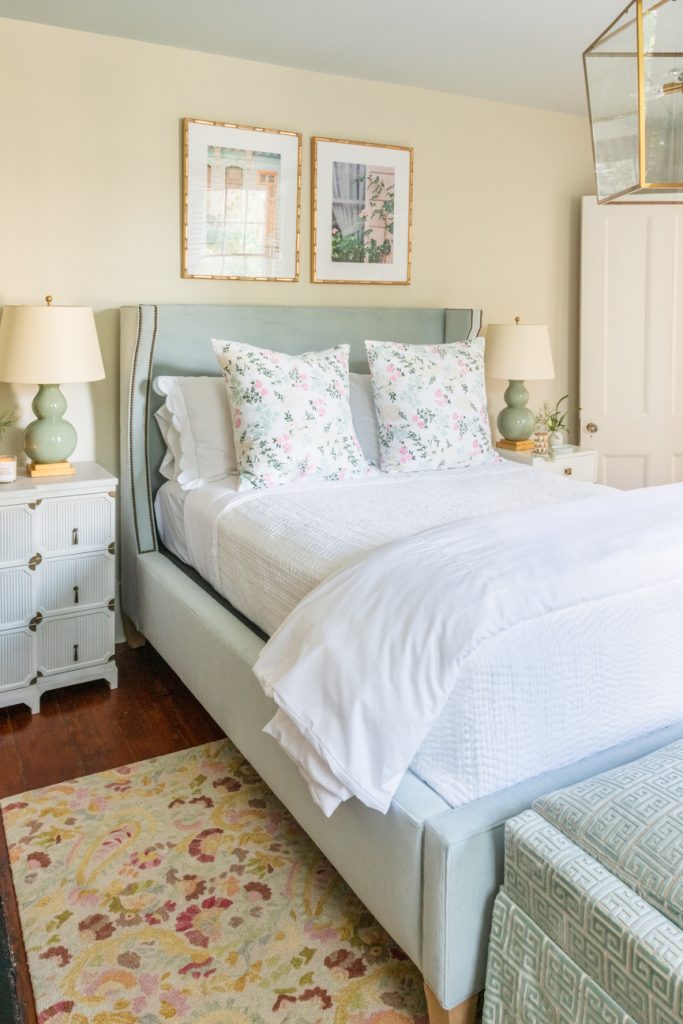
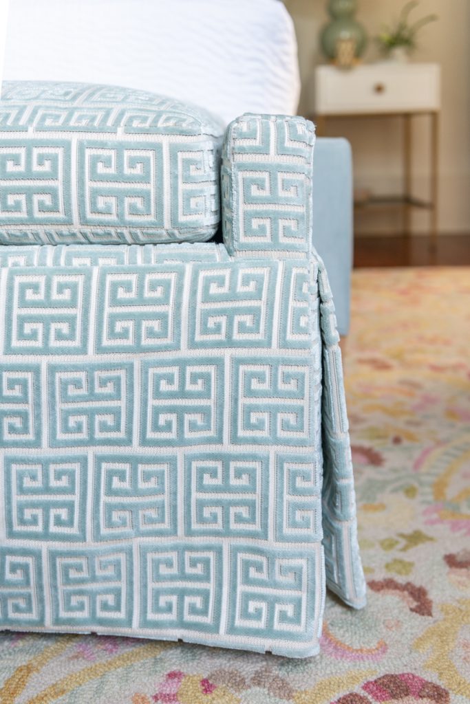
Since the bed has sleek wood legs, I wanted one piece of furniture to be skirted to soften the space. I chose the Sophia Bench (c/o) in Ceasar Spa, which is a beautiful greek key pattern. The cushion is incredibly soft and it’s the perfect piece to anchor the bed. The greek key details compliment the colorful Annie Selke rug.
Once I measured for the queen bed, I realized that I have more space on the left side. This allowed me to find a larger chest to fill the space. Gabby’s Alexis Chest (c/o) was the perfect size and height for the bedroom. It has a beautiful ribbed wood design with brass accents. The vintage-inspired chest actually has faux drawer fronts to reveal open shelving. This is a beautiful piece of furniture!
Since the right side of the bed has less space, the May nightstand (c/o) was the perfect choice. It has an overall smaller width and depth, making it a nice fit between the bed and the door. I like to mix and match nightstands, but I do make sure that they compliment each other with color, accents and height. Both nightstands are a shade of white with brass accents and have similar heights. Even though the May nightstand is smaller in scale, it still has ample storage with a drawer and bottom shelf.

Artwork.
To add color and personality into the room, I incorporated artwork by a friend and photographer, Anne Rhett and a fellow Georgian Kate Scriven. I discovered them both through Instagram.
Anne Rhett is based in Charleston, South Carolina and is an incredibly talented photographer. I love following her travels, especially when she shoots in film. I’ve also worked with her a handful of times with Lavin Label so I’m thrilled to have her work displayed in my guest bedroom. I love her soft color palette and how she perfectly captures her clients’ emotions! It was tough to choose which two pictures that I wanted to frame but I ended up choosing the a vignette of a vintage car (c/o) next to a door that she took while in Cuba and a detail shot of English climbing roses (c/o). I like how they look next to each other and bring out all of the colors in the space. Both pictures were framed in a blush bamboo Lucia frame by Framebridge.
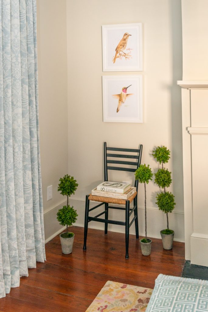
Classic white framed bird prints from Kate Scriven Art flank the fireplace. I chose the birds based on the colors in the room, especially the floral decorative pillow shams. I love how the birds are completely different yet share similar elements such as a flowering branch or soft color palette. These details make them perfect for grouping. You can order her prints (c/o) directly on her website. She was such a pleasure to work with and offers an array of paintings on her site.
Paint Colors.
I’m obsessed with Farrow & Ball’s collection of paint colors. For this bedroom, I used the following:
- Walls: Shadow White (c/o) in Modern Emulsion
- Ceiling: Borrowed Light (c/o) Estate Emulsion
- Trim + Fireplace: Shaded White (c/o) in Modern Eggshell
Bedding.
You’ll notice that most of my guest rooms have white bedding. The crisp, white bedding makes a room feel luxurious — so I’ve incorporated Garnet Hill’s Scallop Embroidered sheets and duvet cover (c/o). I also like the added embroidered details. I’m obsessed with their white Dream Quilt, which is a lightweight cotton quilt that can be used all year round. (I also have the same quilt on my master bed.) It’s a timeless choice that pairs well with other patterns. And it helps that it’s easy to clean since I have two dogs!
I’ve incorporated two types of decorative shams on the bed. The euro shams are a dainty pattern from Biscuit Bedding called Dorothy (in multicolor). I snagged these beauties when they were on sale earlier in the summer! I paired them with embroidered shams from Courtland and Co. I opted for the blue scalloped detail edging.
Window Treatments.
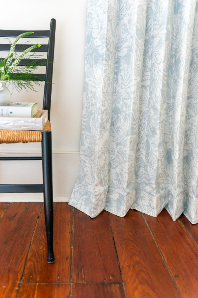
I’m obsessed with Thibaut’s Chardonnet Damask (c/o) fabric. I chose this beautiful subtle pattern for the window treatments. Not only do the black out drapes tie everything together but they also work nicely with the aqua greek key pattern on the bench. I’m drawn to Thibaut’s timeless + quality fabrics.
Photography by Southern Paprika Studios


No Comments